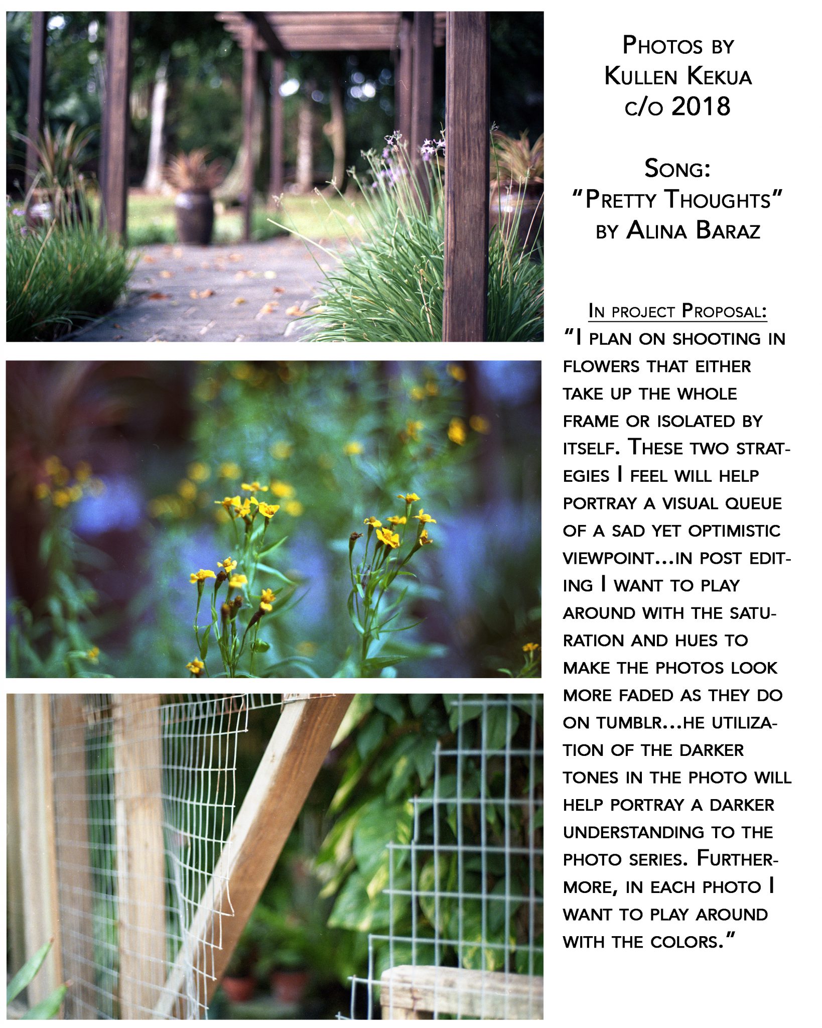
PROJECT OVERVIEW:
Throughout Photo 1 and the first half of Photo 2, we’ve been working on building our photographic eyes to see in terms of light: highlights and shadows (black and white) rather than in color. Now is our chance to explore how color can be used to communicate emotions.
To do this, you will choose a song that you have a strong emotional attachment to and shoot a roll of color film to communicate the emotions of your song. Choose a song that does NOT have an official music video so it doesn’t influence how you utilize color in your roll. Listen to your song and identify what colors it stirs up in your head, think about specific shapes, places, people, things. What does this song look like in your head? Is it dark and contrasty or soft and bright?
From this roll of color film, you will choose 3 pictures that you think best represent your song, edit the pictures on Photoshop to make basic improvements, and print them up from our digital printers. This project will get you more acquainted with a digital workflow, including scanning, editing, and printing.
While shooting and editing, be aware of the following things in the world around you:
- Hue – the actual color you’re seeing (red, orange, yellow, green, blue, purple)
- Saturation – the intensity of the color you’re seeing (dull and faded vs intense and vibrant)
- Value – the tone of the color you’re seeing (light vs dark)
- Color Palettes – the relationship of colors working together within a composition (monochromatic, analogous, complimentary – see more below)
Shoot the W H O L E COMPLETE ROLL of color film, and return it to Ms Ua on Monday, October 14 (the day we come back from Fall Break, this is not a joke). Since we can’t process color film in our darkroom, Ms Ua will get it processed and we will then scan the negatives into the computer.
IF YOU DO NOT TURN IN YOUR COMPLETED ROLL BY MONDAY, OCTOBER 14, YOU MAY HAVE TO PAY TO GET YOUR FILM PROCESSED ON YOUR OWN. YOU HAVE BEEN WARNED.
Scroll down for examples of photographs with exceptional use of color.
GOAL: Your task is to shoot a roll of COLOR film related to your emotional reaction to a song of your choice, then print 3 images that best communicate your idea of the song.
ROLE: You are a music video director and you are proposing an idea to a musician/group
AUDIENCE: AUDIENCE: A musician/musical group of your choice
SITUATION: You are a music video director and have a great idea for a music video for your favorite music group. To convince them that you should direct a music video for them, you need to create a proposal with a visual storyboard composed of 3 pictures that utilize color theory to communicate the emotions of the song.
PRODUCT/PERFORMANCE AND PURPOSE: You will create a set of 3 images that utilize color theory to communicate emotions of a song of your choice.
STANDARDS & CRITERIA FOR SUCCESS: Photo2-Project5-Color
- Create: Students will independently use their learning to apply imagination and intellect to conceive, develop, and craft works of art to communicate ideas, experiences or cultural expressions.
- Respond: Students will independently use their learning to respond to and reflect on their work and the work of others in historical, cultural, or personal contexts.
STUDENTS WILL BE ABLE TO:
- Purposefully use color theory to communicate a sense of the invisible (emotion and music)
- Recognize elements of color theory in artwork and cinema
- Scan negatives and utilize basic computer editing techniques to improve prints
- Print digital pictures using professional printers
Color Theory:
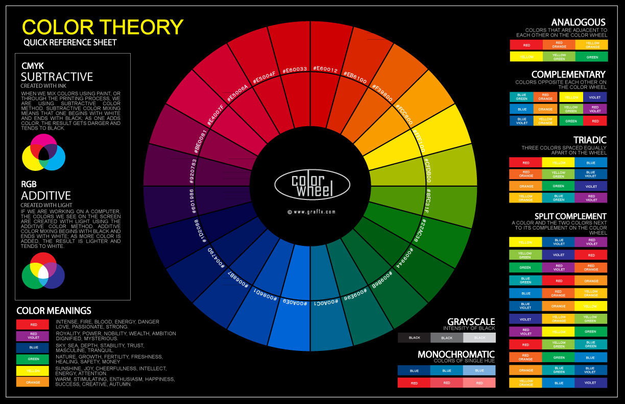
Cool/Receding Colors – blue, green, purple
- these colors have a calmer, more peaceful and serene feeling to them

the range of blues taking over the frames creates a cold, chilly feeling.
Warm/Advancing Colors – red, yellow, orange
- these colors come across as more active, energetic, and warm

the bright reds and yellows in this picture creates a fiery, energetic scene
Analogous Color Harmony – colors directly next to each other on the color wheel will have a more balanced/harmonious feel

the colors in this picture are analogous, or right next to each other on the color wheel: yellow, green, blue
Complementary/Opposite Colors – 2 colors on opposite sides of the color wheel, such as red-green, blue-orange, yellow-purple. When placed next to each other, they create very energetic scenes, causing each color to pop.
-
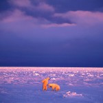
- Yellow light falling on the Polar Bears make them stand out against the otherwise purple background
-

- The red lipstick pops against the pale green light of the background
-

- Afghan Girl, photographed by Steve McCurry. The girl’s captivating eyes are balanced by the rust-red of her garment and the green of the background.
Look at how Ernst Haas’ 3 photographs of gondolas in Venice have a completely different feel, just based on their color alone.
-
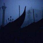
- deep blues create a cold, mysterious mood
-

- Analogous green, blue, and pale yellow gives this a peacefully/harmonious feel
-

- The orange light on the wall gives this a warmer feel
CNN made a series called COLORSCOPE exploring how colors are interpreted differently in cultures around the world. Here’s one of their videos on the color blue, but check out the rest of them too!
PREVIOUS STUDENT WORK